Leaderboard
Popular Content
Showing content with the highest reputation on 02/28/17 in all areas
-
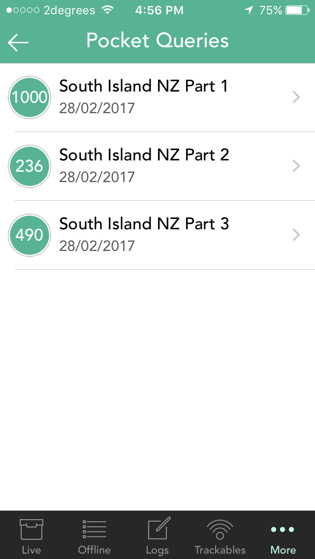
After a Pocket Query is downloaded on the "Pocket Queries" screen, there is no indication left behind that the download has completed and when it was last done. I think it would be a nice addition to Cachly if the individual Queries could be marked in some way (a background or typeface colour change maybe) to indicate that they have already been downloaded. Not sure if it's possible to extend this by having the original colour return if the Pocket Query is refreshed at geocaching.com (which would indicate it needs re-downloading into Cachly). The addition of the date of download (space permitting) would also be a great feature.
 1 point
 -

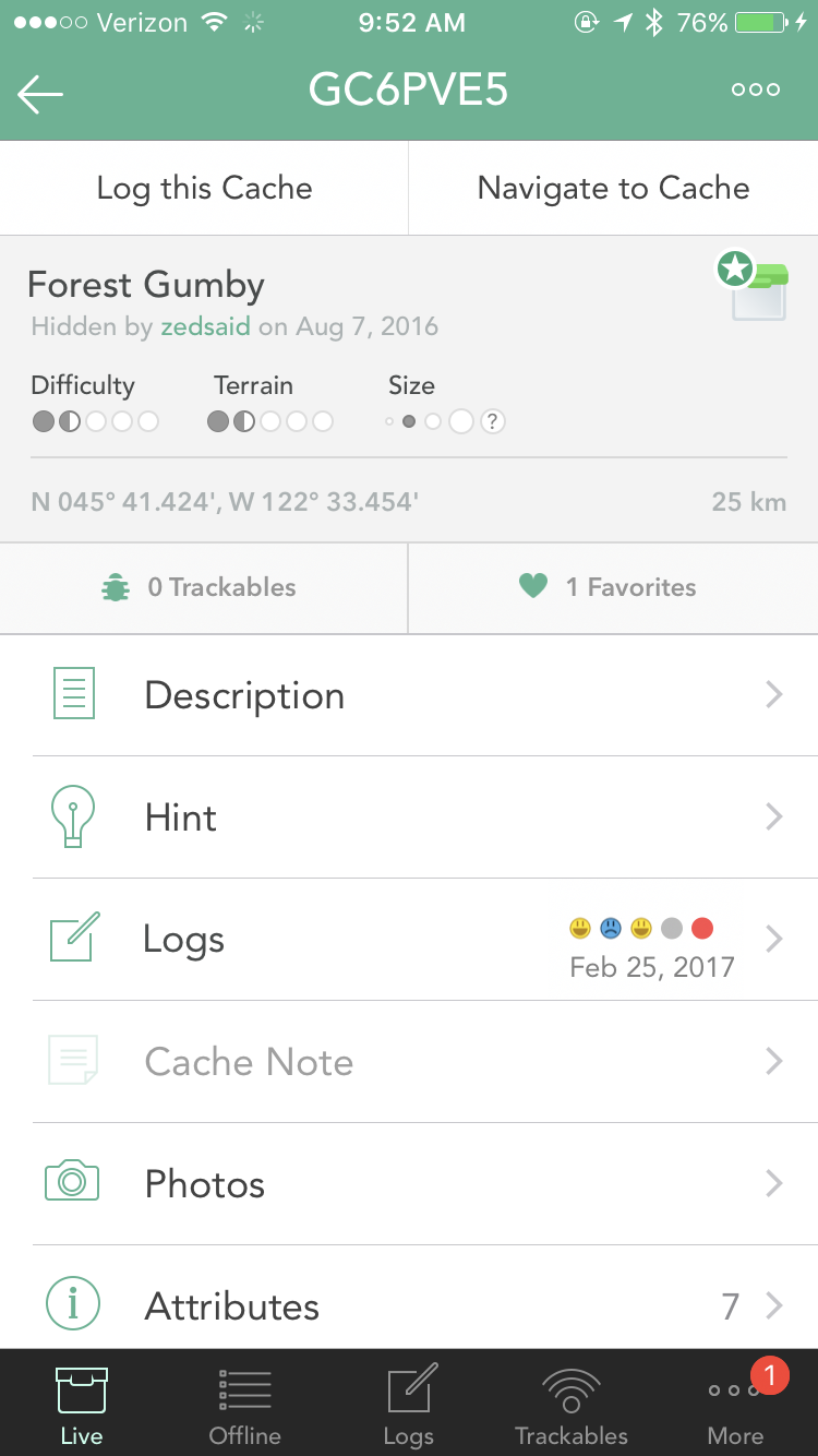
DNF color in overview screen
Nic Hubbard reacted to Bolling for a question
After seeing the concept, I stick with my vote. It looks good.1 point -

DNF color in overview screen
Nic Hubbard reacted to barefootguru for a question
I like it Clear what each entry is, and consistent with icons on map.1 point -
That would make it far better indeed! I like it!1 point
-

DNF color in overview screen
ChrisDen reacted to Nic Hubbard for a question
Posting this for more discussion. Thoughts? P.S., this is starting to grow on me... 1 point
 -

DNF color in overview screen
ChrisDen reacted to MrGigabyte for a question
Assuming the Russians do not influence this vote, I cast mine as follows: I vote for the traditional/original colour scheme - Yellow smile, Blue frown, etc.1 point -

Cachly 2.1 and map clustering input needed
Nic Hubbard reacted to CanUSeeIT for a topic
I agree with the the approach you've outlined. In general I think any feature like like this should: 1. Only go into effect as a last resort, and 2. Have a switch so an informed user can choose to turn it off, and suffer the consequences (fewer caches showing, etc.) with a warning that consequences are happening.1 point -

Mobile Network Signal Multi's
Nic Hubbard reacted to ShammyLevva for a topic
I've had this a lot too ususally happens when phone is in anything less than a 3G area. I'd suggest that if the user is in the offline map or using offline map and not on wifi then it defaults to saving offline. Typically if a user knows they are in a poor signal area they will switch to offline maps and/or offline tab. Cachly could take that as a cue to use offline mode for saving waypoints (and cache notes).1 point -
White text on green background does not work
Nic Hubbard reacted to rragan for a question
Coordinates line is especially hard to read with grey text on a grey background. In general, higher contrast is better for an app being used outdoors in sunlight.1 point -
Another feature into Cachly
ShammyLevva reacted to Nic Hubbard for a topic
Welcome to Cachly! Do you just mean a feature that zooms the map in the closer you get to the cache? If so, this isn't yet possible in Cachly, but we do have it on our feature list!1 point