Search the Community
Showing results for tags 'colours'.
Found 1 result
-
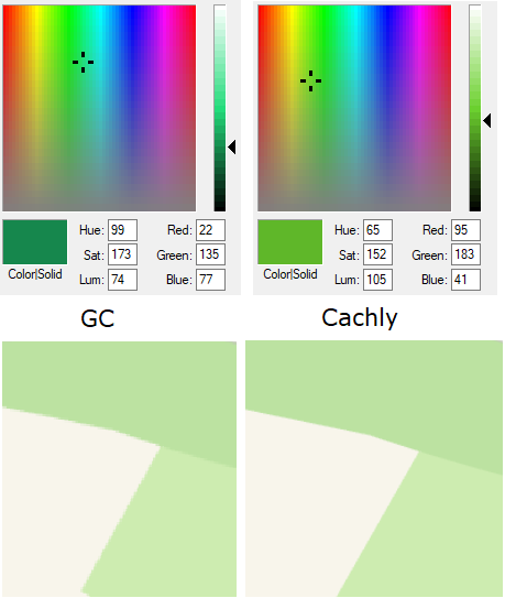
There is general agreement that 1 in 12 men and 1 in 200 women are colourblind. The term ‘colourblind’ is misleading, most colourblind people can see many colours but not as broad as others. Strongly colourblind people might only be able to tell about 20 hues apart from each other, with normal colour vision this number raises to more than 100 different hues. Protanopia, deuteranopia, and tritanopia are types of dichromacy, which means you have only two different colour receptors (cones) compared to three with normal colour vision. For me, the quantity or size of the coloured object will determine is clarity. A thin red line on a black background is invisible to me. Likewise a thin yellow line on a green background is also invisible. They are the colours I am uniquely deficient with, others will be different. If you increase the amount of colour greater (ie. thicken the lines) colours become somewhat visible. Additionally a green dot next to a yellow dot might both be visible, but I could not tell what colour they are. A light colour however is easier to see on a black background than on a white one, due to an increase in contrast. Changing a phone to dark mode does not alter the hues of colours, so for me results in no improvement to distinguish colours apart. Bright sunlight also contributes to the problem when out in the field. I did a comparison between GC and Cachly and find the colour tones used are much lighter in Cachly, for trads and multi’s. Trads are RGB=22,135,77 in GC while RGB=95,183,41 in Cachly. <see image attached>. Adopting a darker colour for trads and multi’s will help me, but that may be to the detriment of others. Problem #1. I am unable to see the difference between a traditional (green) and a multi-cache (orange) on the Cachly app, as their hues are too close for my eyes to tell apart, and being small there is not enough coloured pixels for me to distinguish them. Problem #2. I have trouble seeing traditional caches amongst the various green coloured backgrounds (parks, etc). I am colour deficient, as such I have been contemplating asking Cachly for a high contrast mode, but I have reservations this phrase will trigger the change I am after. I am hoping the developer may take into consideration the possible 9% of users who may have trouble seeing caches on the map clearly. Please use your extensive knowledge and developer skills to provide a way for us to get some clarity. Whether that be darkening the default colours, providing several hardcoded colour mode options, or maybe the ability to choose our own RGB’s for cache types. Having distinctly different hues will be the aim, I don’t really mind how you facilitate this. I will be forever grateful. The picture shows the RGB comparison of a traditional cache icon between GC and Cachly. Below that are the typical three greens used for parks (same area from each app).